Are you ready to embark on a creative journey that transforms your designs from ordinary to extraordinary? In this comprehensive guide, we unveil the secrets behind crafting and creating mesmerising mesh color gradients using Figma. Join us as we dive into the artistry and creative alchemy that brings these gradients to life, step by step.
Unlocking the Palette: Mastering Mesh Gradients in Figma
Color gradients are the heartbeat of visually striking and modern designs, and mastering mesh gradients adds an extra layer of sophistication to your designs. Whether you're a design enthusiast or an experienced professional, this guide is your key to unlocking the secrets of Figma's creative potential.
Selecting the Background Tone
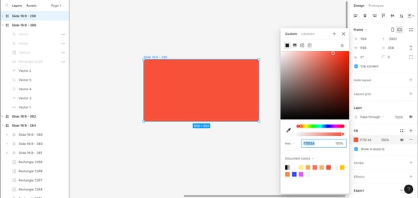
Every masterpiece begins with a canvas, and yours is no different. Start by choosing a background color from our carefully curated palette. This sets the stage, establishing the predominant tone that will breathe life into your gradient.
Creating Shapes
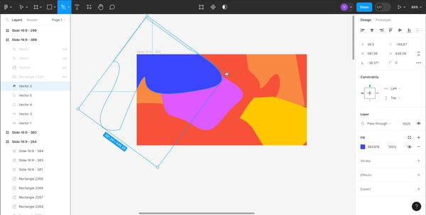
The canvas design comes alive as you create and draw random shapes over the chosen background. This is where the magic begins. Assign a complementary color to each shape, ensuring a seamless transition that forms the basis of your gradient. It's not just about colors; it's about storytelling through the shapes you design.
Overlaying White
To add an ethereal touch to your design, introduce a white layer with 3% opacity over the shapes. This delicate touch is the secret sauce to achieving a smooth gradient effect. Apply a layer blur, ensuring the transition is seamless, while maintaining the subtle concealment of the initial shapes. It's a delicate dance between opacity and subtlety.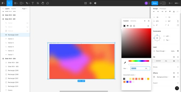
Adding Texture
Elevate your gradient game by introducing a texture layer with 10% opacity. This isn't just about color; it's about depth and uniqueness. The texture layer adds a tactile quality to your gradient, making it more than a visual treat—it's an experience.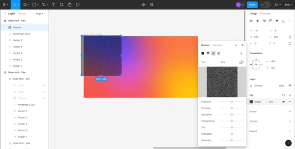
Here is the texture image we use. Feel free to download it and upload it to Figma to build your gradients.

Customization with Symbol Shapes
Inject your personal touch by playing with the shapes of our symbol. This step allows for customization, ensuring the final result aligns seamlessly with your creative vision. It's not just about following steps; it's about creating and making them your own.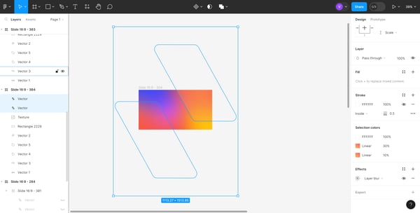
Harvestr's approach to mesh gradients using Figma
In the kaleidoscopic canvas of Harvestr, each hue tells a story. At the forefront of this narrative are our dynamic brand gradients—more than colors, they're a carefully crafted symphony of visual elements defining Harvestr's brand identity. Derived from secondary colors and the bold strokes of our primary red, we've meticulously composed 10 distinctive gradients.


Crafting Vibrancy
These gradients aren't just about aesthetics; they're a strategic move, setting Harvestr apart in the competitive landscape. To elevate them further, a subtle grainy texture has been introduced, adding depth and a touch of uniqueness to each gradient.
Application Note
Consistency is key. The grainy texture should be applied diligently each time a gradient graces our canvases—be it as a background or in the form of UI elements such as call-to-actions. This meticulous approach ensures that our brand identity remains vibrant and consistently impactful.
Harmony in Light and Vibrancy
The five light gradients are a softer rendition of their vibrant counterparts. Achieved by adding a white overlay (40 to 50% opacity), they infuse a touch of elegance into our brand palette, dancing on the border between subtlety and vibrancy.

Color Pairings and General Guidelines
Harmony guides our brand, with core pairings like white or red on a dark blue background. General guidelines ensure a harmonious representation, with recommendations like white and red exclusively complementing dark blue backgrounds.
Our brand gradients aren't just a visual treat; they're a manifestation of Harvestr's commitment to innovation, excellence, and a brand that stands out in the crowd. Dive into the artistry, experiment fearlessly, and let our gradients tell the story of a brand that paints outside the lines.
Conclusion
Mastering mesh color gradients in Figma isn't just a skill; it's an art form. As you experiment fearlessly with these steps and gain insights from Harvestr's approach, remember that creativity knows no bounds. Let your designs tell a story, captivate your audience, and elevate your creative endeavors. Happy designing!